


The Challenge
The church’s previous logo had become visually outdated and no longer reflected the energy, vision, or growth of the congregation. It felt overly generic, lacking the distinctiveness and personality needed to represent a vibrant, evolving faith community. The mark also lacked the clarity and impact required to thrive across modern contexts—especially as the church expanded its outreach through digital platforms, signage, and print materials.
This rebrand needed more than just a visual update—it needed to feel bold, grounded, and welcoming. My goal was to create a refreshed visual identity that could bridge tradition and modernity, resonate with both new and longtime members, and communicate the church’s unique sense of rootedness and renewal.

The Mark
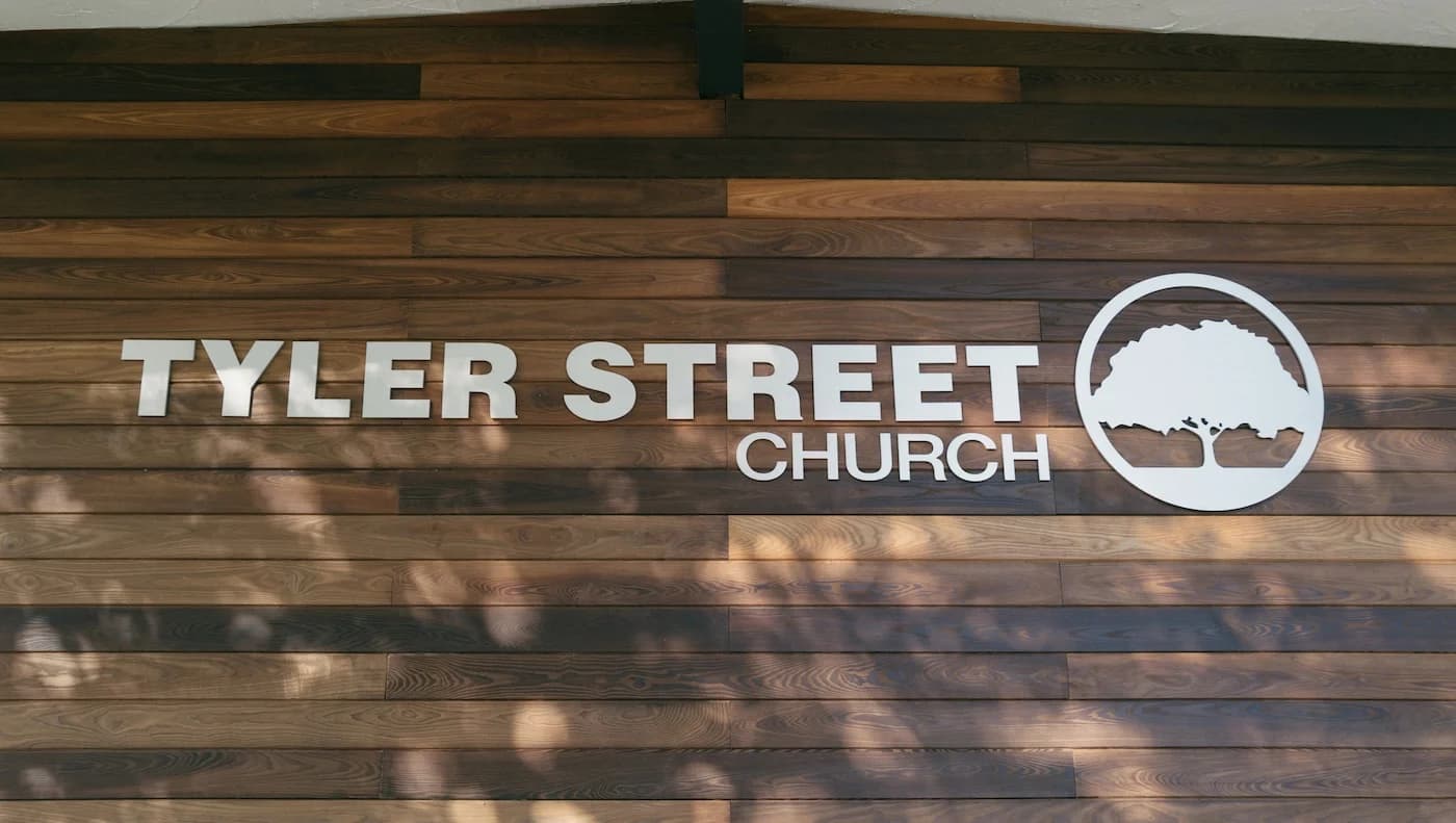
At the heart of the brand is a tree — a mark that serves as both a literal and symbolic representation of the community it stands for. Sacramento, often called “The City of Trees,” is known for its expansive urban canopy. The tree in the logo draws directly from this identity, grounding the mark in a sense of place and belonging.
Beyond geography, the tree carries layered symbolism. In the context of the church, it represents a canopy — a covering of protection, unity, and spiritual shelter. Just as trees gather people beneath their branches, the mark speaks to a communal, life-giving presence. It’s a symbol of growth, rootedness, and vitality — a living image that captures the values of connection, strength, and renewal.


Designed For Adaptability
This visual identity was created with purpose — not just to represent the church, but to support its mission in a lasting and practical way. Every element has been thoughtfully designed to carry the heart of the church into both digital and physical spaces. Whether it's printed on a banner, displayed on a screen, or handed out on a flyer, the logo remains clear, strong, and recognizable.
Its structure allows it to adapt seamlessly to different uses without losing its impact, making it a dependable part of how the church shows up in the world. Over time, this consistency builds familiarity and trust, helping the church be more easily recognized and remembered in the community. It’s more than a mark — it’s a visual anchor that reflects who the church is and helps carry that message forward with clarity and strength.