Northshore Community Church
UX/UI DESIGN
February - May 2025
My Contribution & Toolkit
Research & Analysis
Conducting user interviews, surveys, audience insights and competitive analysis
Planning & Collaboration
Stakeholder alignment, site maps and user flows using Miro
Design & Testing
Wireframes, high-fidelity mockups and asset creation using Figma, Illustrator and Photoshop
Problem
The existing Northshore website was confusing and difficult to navigate. It wasn’t designed with the primary audience in mind, and it failed to guide users toward the information and decisions they were looking for. Key issues included:
- Navigation was cluttered and inconsistent.
- Information for first-time guests, families, and those seeking support was hard to find.
- Calls-to-action weren’t aligned with user needs, causing friction in completing key tasks.
Solution
I redesigned the website with a clear focus on audience needs and decision-making. The solution centered on:
- Audience-centered content: Prioritized information for first-time guests, families, and those seeking assistance.
- Streamlined navigation: Clear paths to key actions like visiting, connecting, or requesting help.
- Guided decision-making: Calls-to-action and content flow that help users accomplish tasks efficiently.
- Visual clarity: Modern, organized layout that communicates trust and accessibility.
Beginning with the users
I developed four detailed user personas grounded in research and audience insights, capturing the diversity of the church’s visitors - from first-time guests to members seeking deeper connection. Each persona highlighted distinct goals, pain points, and needs, which directly informed key design decisions. For example, navigation was structured to help newcomers easily find service times, while content prioritization ensured returning members could access community resources quickly. These personas became a central reference throughout the project, shaping the user experience and guiding support pathways to better meet each group’s needs.
Alex
Software Developer
Single
28 years old
Kirkland, WA
Goals
Learn what the church is like before attending, see service times, and find out details such as location and where to park.
Pain points
Feels nervous about visiting a new place and doesn’t know what to expect.
Needs from website
A page with information stating expectations, service times, directions, and an overview of beliefs and culture.
Taylor
Nurse
Married, other of 3
37 years old
Kenmore, WA
Goals
Find kids’ and youth programs, join small groups, and connect with other families.
Pain points
Hard to find clear info on children’s ministry or upcoming events; wants to involve her husband too but needs a simple way to get started.
Needs from website
A “Plan Your Visit” page, clear service times, directions, and an overview of beliefs and culture.
Robert
Business Owner
Married
56 years old
Woodinville, WA
Goals
Support the church through regular giving, see impact stories, and stay updated on church initiatives.
Pain points
Gets frustrated if the giving process is confusing or too many clicks.
Needs from website
Easy, secure online giving, access to giving history, and transparency about how donations are used.
Maria
Retail Associate
Single
29 years old
Bothell, WA
Goals
Learn if the church offers financial help, food pantry, or community resources.
Pain points
Already under stress and may feel embarrassed asking for help.
Needs from website
Discrete and available resources/help page, compassionate tone, clear steps to request assistance, and community partner info.
The user journey
Next in the process was to create a user flow map to visualize how each persona navigates the site, from landing pages to key actions like signing up for events or accessing resources. While the “three-click rule” is widely debated, we intentionally designed each flow so that key actions were within three steps, keeping important functions easily reachable without burying content. This approach highlighted potential bottlenecks and informed improvements to navigation and content hierarchy, ensuring both new and returning users could accomplish their goals efficiently.

Persona user flows
Creating the Site Map
I developed a site map outlining the main blocks of the site, organizing content into logical sections to support both first-time visitors and long-term members. This structure helped clarify navigation priorities and informed the layout of menus, landing pages, and resource hubs. By mapping out the site’s hierarchy early, I was able to ensure a coherent experience where users could quickly find key information without confusion.
The sitemap is organized round five primary categories:
- Locations: Serves users who want to connect with a physical campus or explore online options, including key details like service times, directions, a small about section and the option to fill out a “Plan Your Visit” form.
- Next Steps: Designed to guide users deeper into community engagement - joining groups, exploring family resources, serving, baptism, and giving.
- About: Provides background on the church’s identity, beliefs, and leadership, establishing trust and transparency.
- Find Support: Ensures that care resources such as financial assistance and pastoral support are quickly accessible in moments of need.
- The Latest: Highlights dynamic content such as upcoming events, the current message series and a way to view previous messages, encouraging users to return frequently.

Full Site Map
Connecting the wires
I created wireframes for the Home and the Next Steps pages, focusing on the most critical entry and engagement points for users. These low-fidelity layouts helped translate the site structure into clear navigation and content hierarchy.

Home Page wireframe
The homepage served as a universal funnel, spanning the needs of someone who was a first-time visitor seeking basic information like service times, or a long-term member looking for community resources, everyone began their journey here.

Next Steps Page wireframe
The Next Steps page then guided deeper involvement, offering clear pathways into groups, spiritual steps and volunteer opportunities. Developing these low-fidelity layouts allowed me to test content hierarchy, ensure navigation worked across user types, and refine flows before moving into high-fidelity design.
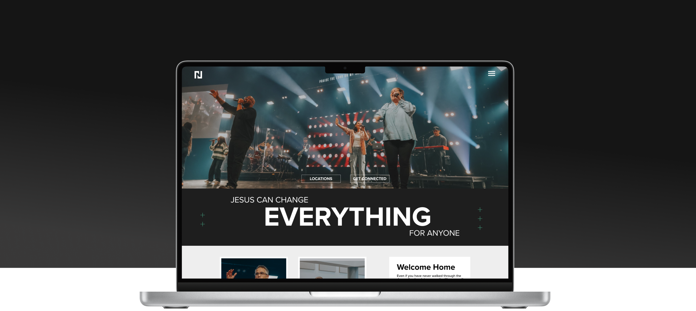
High-fidelity designs
I brought the Home, About, and Next Steps pages into high-fidelity to capture both function and feeling. The visual design aimed to communicate the church’s welcoming atmosphere through warm imagery, open layouts, and approachable typography. Card-based highlights on the homepage drew attention to the main funnels such as next steps and support ministries. Across all pages, the design emphasized lightness and clarity, creating an experience that felt inviting while still guiding users toward meaningful next steps.

Home Page

About Page

Next Steps Page
Project outcomes
The new site is currently in development, with these designs serving as the foundation for implementation. The redesigned site laid the foundation for a clearer, more welcoming user experience. Early design decisions, from the site map to wireframes, ensured that navigation is intuitive, key actions are easily reachable, and the overall visual tone reflects the church’s inviting atmosphere. The highlights below summarize the most tangible impacts of the project so far.
Streamlined Navigation
Key actions are now within easy reach, reducing friction for both new and returning users.
Clear Site Structure
The reorganized site map simplified content hierarchy, making thesite easier to navigate and maintain.
Updated Visual Experience
Light, approachable design and card-based highlights create an inviting atmosphere that guides users to meaningful next steps.
Key takeaways
This project reinforced several strategic principles that guided design decisions and strengthened the overall user experience. The following points summarize the most important lessons and design priorities that emerged from the process:
- Design for multiple audience types: Ensure the experience meets the needs of new users as well as long-term users without compromising either.
- Use a clear site map to guide structure: A well-organized architecture simplifies navigation for users and makes content easier for stakeholders to maintain.
- Keep important actions within reach: Even without rigid rules like the “three-click rule,” designing flows that prioritize accessibility improves usability.
- Balance clarity and visual aesthetic: A clean, welcoming interface helps users engage without feeling overwhelmed.
- Iterate with purpose: Wireframes and low-fidelity testing allow potential issues to be caught early, saving time during high-fidelity design and development.