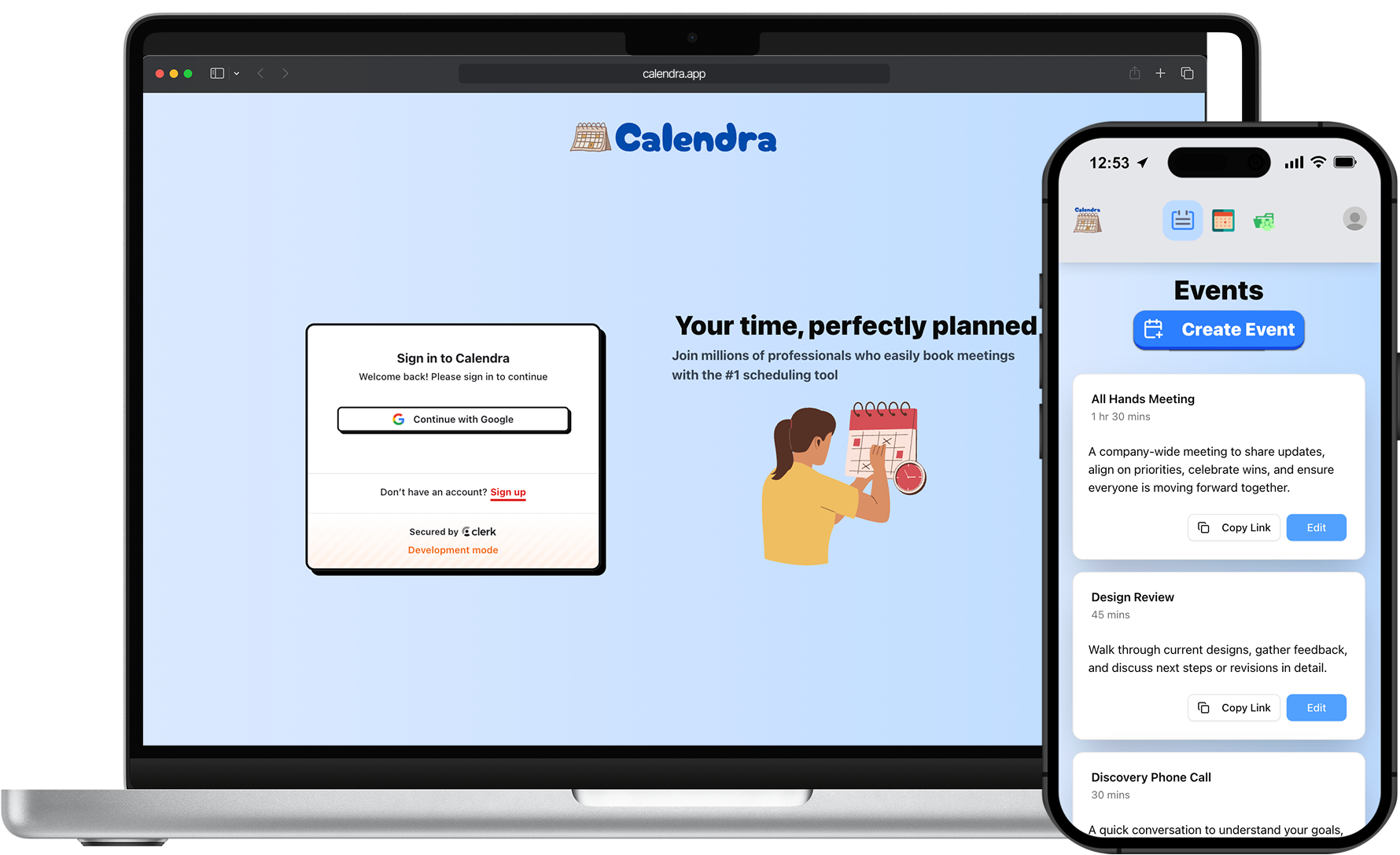
Calendra
PRODUCT DESIGN
FULL STACK
Calendra is a full-stack web application designed to mimic the functionality of the scheduling app Calendly. Using Google's OAuth, you can keep all of your events and meetings organized, as well as receive external meeting invitations.
Core User Flows
Availability & Scheduling
The flow begins with the primary user setting their availability, specifying days, times, and buffers. When they create a public event, they can share a link with invitees. The receiving user can then join the event and select a date and time that fits within the primary user’s availability. Once a slot is selected, both users receive instant confirmation, ensuring the meeting is scheduled without conflicts.
- Set availability with preferred days and times.
- Availability is saved to the user’s public profile.
- Invitees view the user’s events and select the desired meeting.
- Invitees pick a date and time based on the user’s availability and add their information or notes.
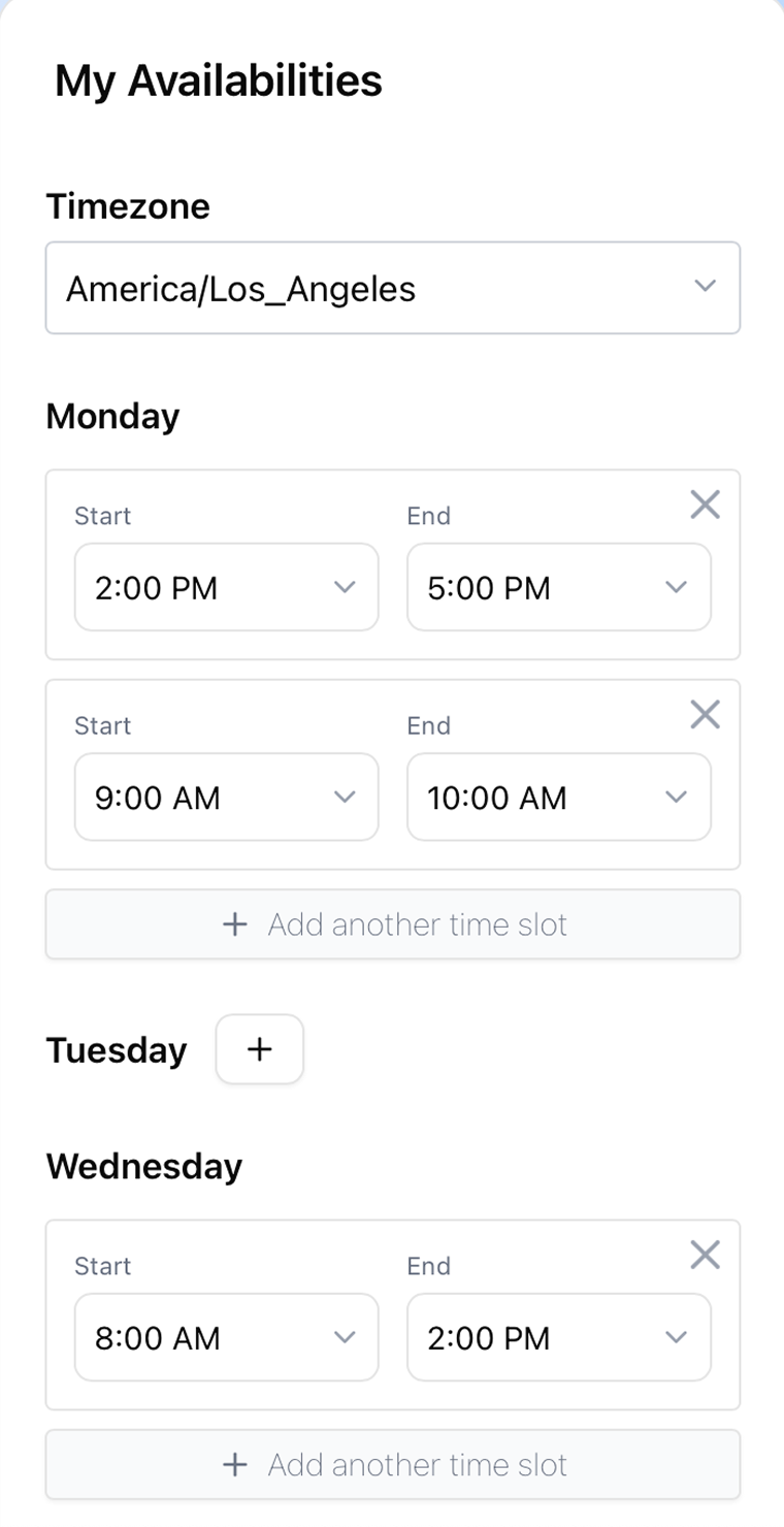
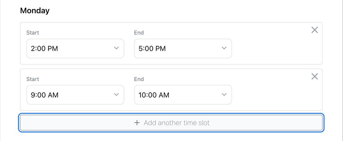
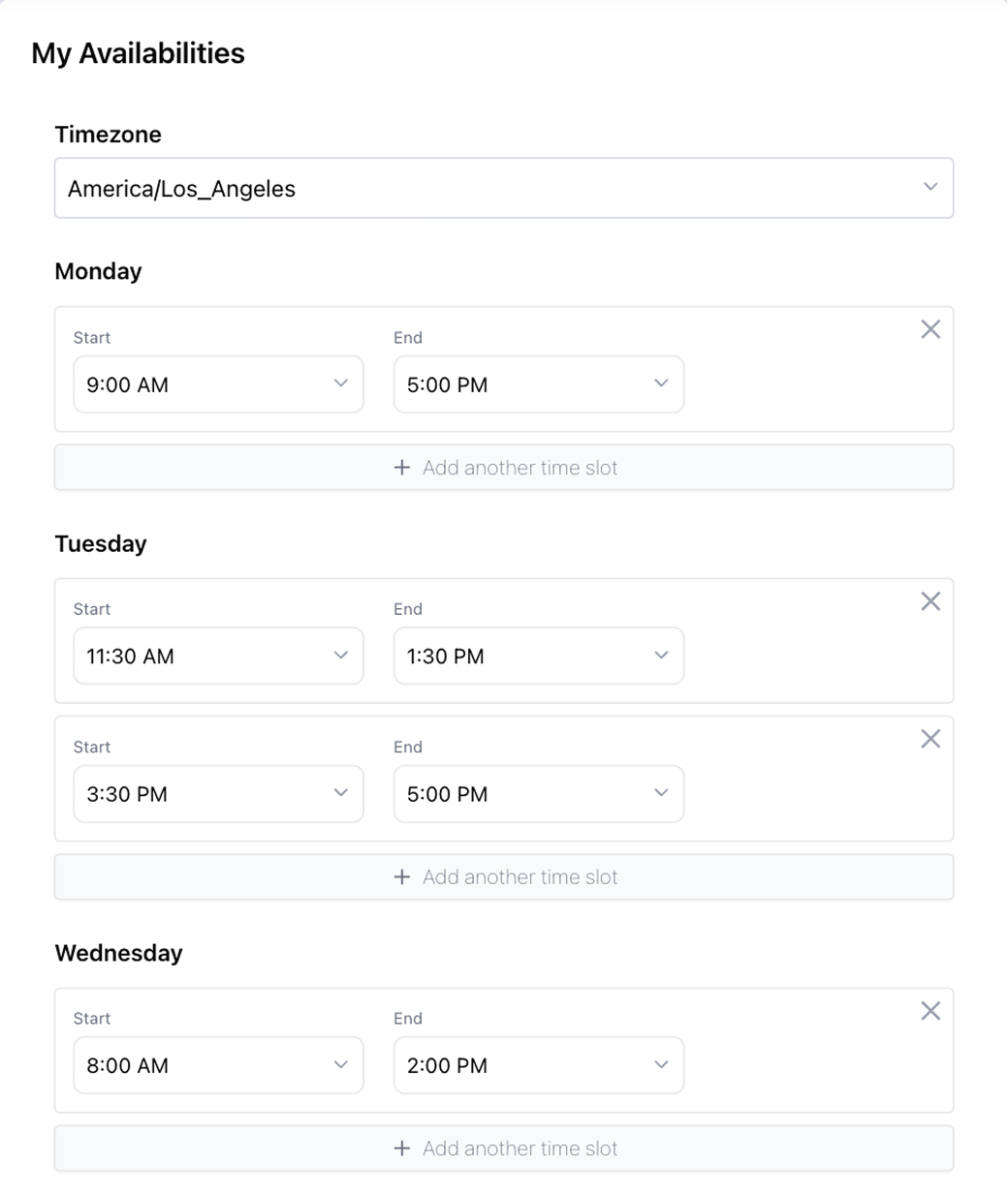
Availabilities Form
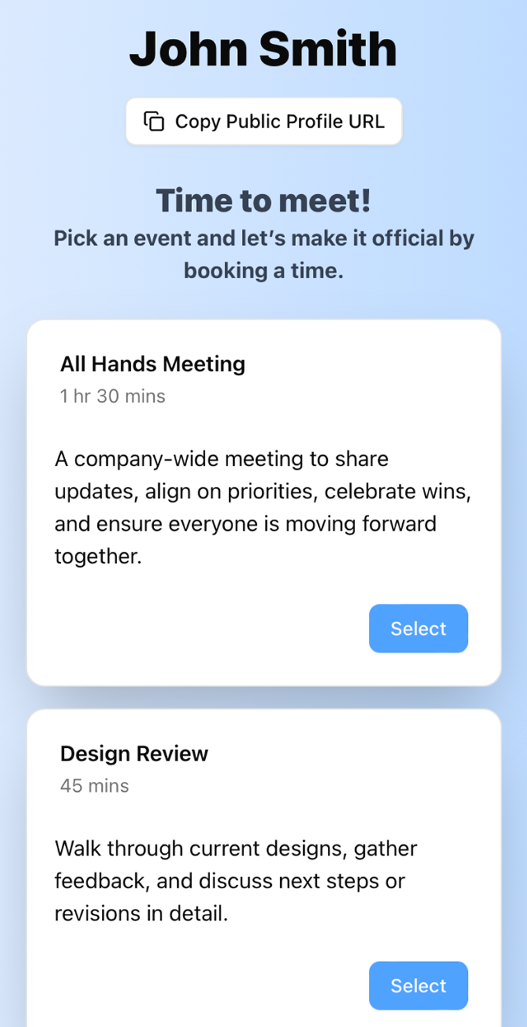
Public Profile Scheduler
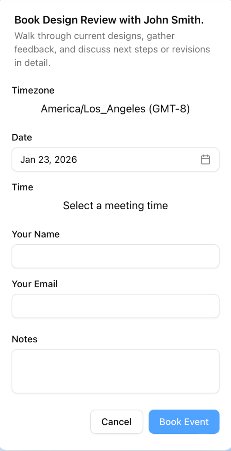
Invitee Scheduling Form
Event Management
This flow shows how users can create and manage events while keeping scheduling simple and seamless. Events can be made public or private, shared via a direct link, and attendees automatically see them on their calendars through OAuth integration with services like Gmail.
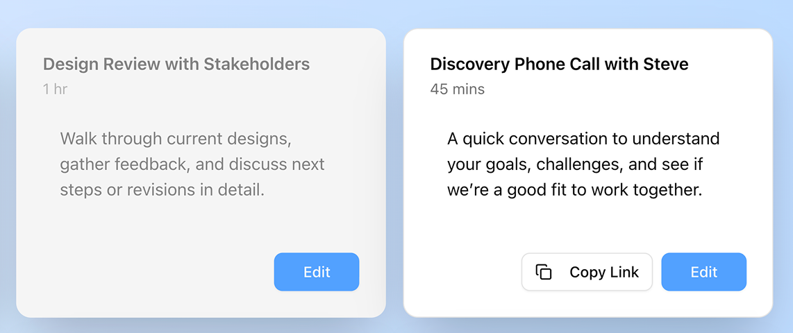
- View all events in one place and copy a direct scheduling link for quick sharing.
- Enter event details including title, date, time and description to create a new event.
- Modify event details and toggle visibility between public or private.
- Events automatically appear on attendees’ calendars via OAuth (Gmail), keeping everyone in sync.
Key Features
Accessibility & Usability Considerations
Scheduling tools are only effective if users can clearly understand their options and interact confidently. In a product where time selection, event creation, and availability management are core, even small misunderstandings can lead to missed meetings or confusion. Accessibility was considered not as an afterthought, but as an integral part of the design.
Every interactive element — from inputs and buttons to forms and lists — was designed to communicate status and state clearly. Users receive immediate feedback when an action isn’t allowed, forms indicate errors with actionable messaging, and keyboard users can navigate the entire interface without relying on a mouse. Subtle visual cues, like grayed-out events for private items or clearly visible focus rings, reinforce comprehension and ensure that users can make informed scheduling decisions quickly and confidently. By approaching accessibility and usability this way, the app feels reliable and intuitive for everyone, whether they’re keyboard users, mobile users, or scheduling across time zones.
Focus Ring / Keyboard Navigation
- Interactive elements have clear focus states for keyboard users.
- Users can navigate without losing context.
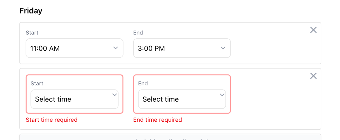
Error Handling & Validation
- Forms give immediate feedback for unavailable times or invalid input.
- Users can correct mistakes quickly, preventing scheduling errors.
Visibility Cues
- Non-public events are grayed out on the events page.
- Users instantly understand which events are shareable.
Calendar Integration
Keeping users’ schedules in sync across platforms was a core focus of this app. Events aren’t just stored locally — they automatically appear on attendees’ calendars, making scheduling seamless and reliable. Integrations were designed to be simple for users while maintaining robust backend logic to prevent conflicts and ensure consistency.
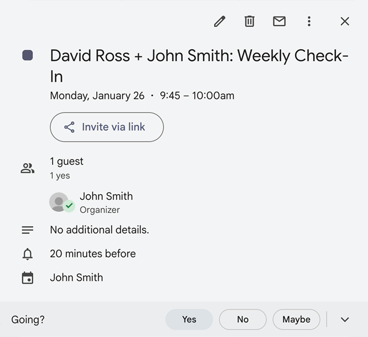
- Automatic Calendar Sync - Confirmed events are added directly to Google or other connected calendars via OAuth.
- Conflict Prevention - The system checks availability before adding events to avoid double-booking and overlapping appointments.
- Simple, Clear Sharing - Public events can be copied and shared with a single link, letting invitees book without creating an account.
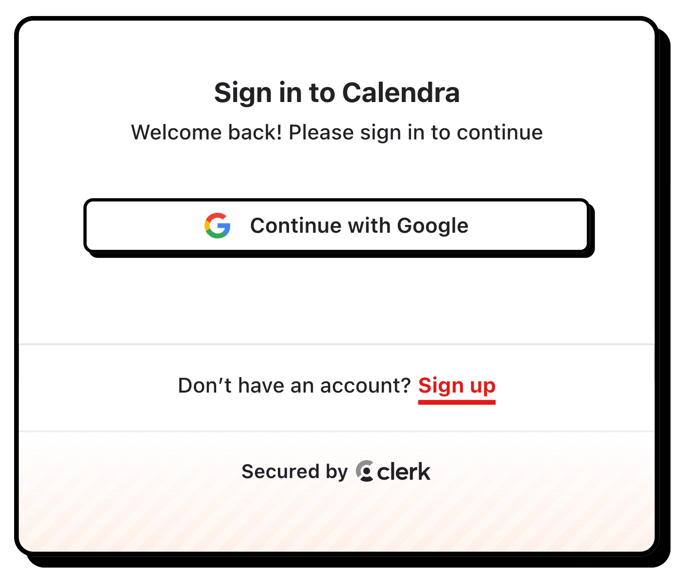
User Authentication
Authentication plays a foundational role in the product, enabling secure scheduling, personalized availability, and protected event management without adding friction to the user experience. By integrating Clerk, I was able to implement authentication and user state in a way that felt seamless to end users while remaining flexible enough to support public profiles, private events, and OAuth-based calendar connections.
- Seamless authentication with minimal user friction. Clerk provides a fast, intuitive sign-in experience, allowing users to access scheduling features without unnecessary onboarding steps.
- Clear separation between authenticated and public experiences. Signed-in users manage availability and events, while invitees interact with public scheduling pages—without requiring an account.
- Secure user state across the entire product. Authentication underpins protected routes, event ownership, and edit permissions, ensuring users only manage their own data.
- Scalable foundation for OAuth and integrations. Clerk’s session handling simplified integrating Google Calendar OAuth, keeping authentication concerns decoupled from scheduling logic.
Overcoming Challenges
Addressing Design Constraints
Designing the availability form was one of the most challenging parts of the product. Users needed a way to define preferred days and times quickly, while the system had to reliably translate those inputs into valid scheduling options across devices and screen sizes. The challenge was balancing flexibility and simplicity—giving users control over their availability without overwhelming them or creating opportunities for error.
Key considerations and solutions include:
- Intuitive interaction - Availability is defined through clear, repeatable time slots that are easy to add, edit, or remove without breaking the flow.
- Responsive design - The form adapts gracefully across desktop, tablet, and mobile, ensuring time selection remains usable on smaller screens and devices.
- Error prevention - Invalid or overlapping time ranges are handled with immediate feedback to prevent scheduling conflicts.
- Scalable logic - Availability inputs are structured so they can be reused across multiple event types without duplication or inconsistency.
This approach resulted in a form that feels simple to use while supporting the complex scheduling logic required behind the scenes.
Key Takeaways
Building this project end-to-end reinforced how closely product design and technical execution are connected. What initially seemed like a straightforward scheduling tool quickly surfaced complex challenges around state management, validation, responsiveness, and accessibility. Working through these constraints required me to slow down, think systematically about user intent, and make deliberate tradeoffs between flexibility and clarity. The result was not just a more robust product, but a clearer framework for how I now approach complex, user-driven interfaces.
- Complex workflows benefit from designing the data model first. Mapping availability, events, and public/private states early reduced UI friction and prevented edge cases from surfacing late in development.
- Clarity scales better than flexibility. Constraining scheduling options and defaults helped users make faster decisions without feeling limited.
- Accessibility is a product feature, not a checklist. Focus states, error messaging, and visual hierarchy improved usability across all devices and interaction modes.
- Building end-to-end sharpens design judgment. Implementing authentication, calendar sync, and real-time updates directly informed how feedback, affordances, and system status were designed.