B&J Body Shop
UX/UI DESIGN
WEB DEV
June - September 2021
My Contribution & Toolkit
Discovery & Analysis
Competetive analysis, persona development and mapping, analytics review, and stakeholder interviews
Planning & Collaboration
Defining project goals and timelines, collaboration with stakeholders
Design & Testing
Wireframes, high-fidelity mockups and asset creation using Figma, Illustrator and Photoshop
Development & Deployment
Built responsive layouts, integrating analytics and deployed using WordPress
Problem
The existing B&J Body Shop website didn’t clearly communicate services or make it easy for users to request estimates. Users struggled to find information, and the site didn’t reflect the trust and expertise of the business. Key issues included:
- Service offerings were hard to understand at a glance.
- Contact and quote requests were buried or unclear.
- Users weren't aware of the damage assessment tool and estimator.
- Site layout and design didn't convey credibility or professionalism.
Solution
I redesigned the website with a clear focus on clarity, trust, and encouraging tool adoption. The solutoions centered on:
- Clear service presentation: Organized offerings for quick understanding.
- Easy contact & quote requests: Prominent calls-to-action and simple forms.
- Promoted virtual tools: Highlighted the damage assessment tool and estimator to drive usage.
- Enhanced credibility: Displayed reviews, certifications, and trust signals.
Beginning with the users
I developed four detailed user personas grounded in research and audience insights, capturing the diversity of the church’s visitors - from first-time guests to members seeking deeper connection. Each persona highlighted distinct goals, pain points, and needs, which directly informed key design decisions. For example, navigation was structured to help newcomers easily find service times, while content prioritization ensured returning members could access community resources quickly. These personas became a central reference throughout the project, shaping the user experience and guiding support pathways to better meet each group’s needs.
John
First Time Customer
27 years old
Owns personal vehicle
Goals
Needs a quick repair and clear guidance on services and pricing.
Behaviors
Searches online for nearby shops, reads reviews, compares services, wants fast and simple booking.
Pain points
Can be untrusting of businesses charging large amounts of money, hesitant to commit without trust signals.
Opportunities
Highlight services clearly, show pricing guidance, provide trust indicators (reviews, certifications), simplify quote process.
Jordan
Repeat Customer
42 years old
Owns multiple vehicles, is familiar with shop
Goals
Regularly brings their vehicle in for maintenance or repeat repairs.
Behaviors
Values efficiency, sometimes books online but prefers personal interaction.
Pain points
Frustrated by slow booking or unclear updates, wants reassurance that loyalty is acknowledged.
Opportunities
Easy rebooking, clear history of previous visits, loyalty messaging, fast quote forms.
Samantha
Local Resident
45 years old
Relies on word-of-mouth recommendations
Goals
Uses trusted local businesses and expects consistent and quality service.
Behaviors
Visits based on recommendations, values personal relationships with staff, may refer friends/family.
Pain points
Limited online presence reduces confidence in trying services, worries about inconsistent treatment or communication.
Opportunities
Showcase reviews and testimonials, highlight community presence, maintain clear, trustworthy messaging.
Steve
Operations Manager
34 years old
Manages a 5-10 vehicle fleet for local company
Goals
Seeks a reliable shop to handle multiple vehicles and establish a partnership.
Behaviors
Evaluates shops based on capacity, turnaround time, pricing, and reliability; interested in long-term agreements.
Pain points
Concerned about inconsistent service or delays, unclear bulk pricing, and lack of dedicated support for multiple vehicles.
Opportunities
Highlight fleet services, dedicated contact channels, bulk/contract pricing, reliability assurances.
The Appointments Task Flow
To simplify scheduling appointments, I mapped out two distinct user journeys, each with its own endpoint, tailored to customer preferences and behavior:
- Contactless Appointments – directs users straight to the client’s Carwise page, providing a fast, online-first option for customers who prefer minimal interaction and maximum convenience.
- In-Person Appointments – guides users to a customized form on the website, ensuring the shop collects all necessary details before the visit, streamlining in-person interactions and reducing back-and-forth communication.
By designing these dual workflows, the site now funnels users efficiently to the appropriate endpoint based on their needs. This approach reduces confusion, shortens the scheduling process, and ensures both customers and the shop experience a smoother, more predictable interaction. The accompanying flowchart visually demonstrates how these journeys guide users seamlessly from entry to appointment confirmation, aligning the digital experience with real-world preferences.
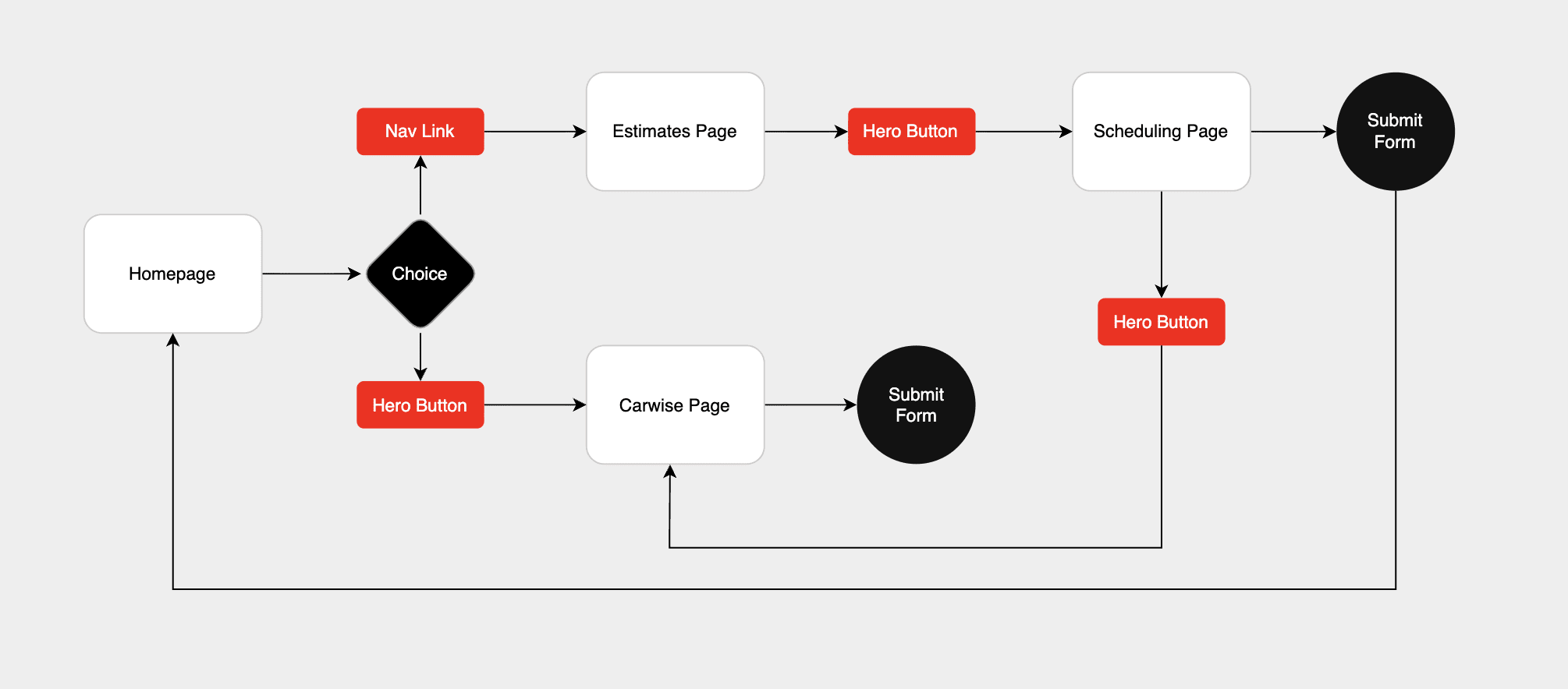
Appointments Task Flow
Wireframing the experience
With the key insights in mind, I began translating ideas into tangible layouts. The wireframes allowed me to focus on functionality and flow without getting distracted by visuals — ensuring every screen had a clear purpose.
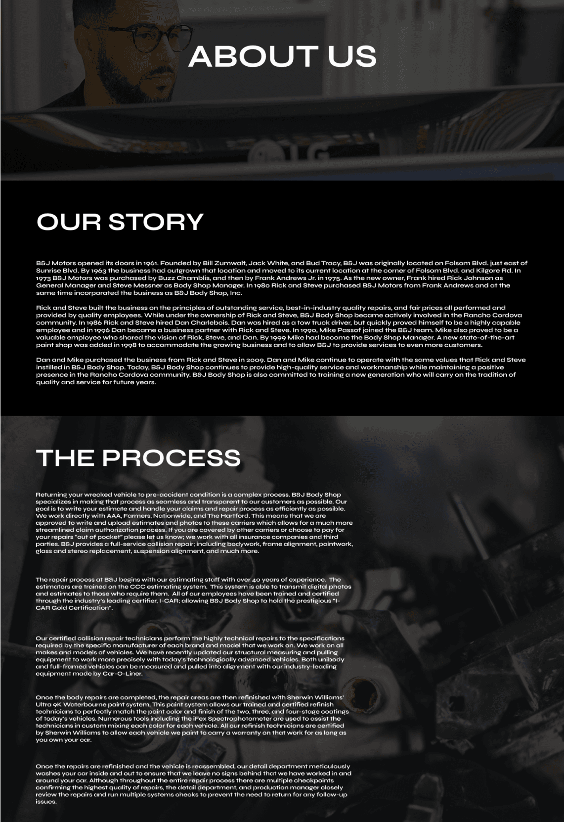
For B&J Body Shop, their history and process aren’t just background details, they’re the heart of the business. The shop has built its reputation over decades in Cordova, and they’ve refined a repair process that customers trust. When designing their new site, we made sure their story had its own space to shine. The dedicated page walks visitors through the shop’s beginnings, their passion for cars and having a shop that is reliable, and the step-by-step care they put into every job. Clear visuals, simple navigation, and a layout that flows like a conversation help customers connect with who they are and why they do what they do.
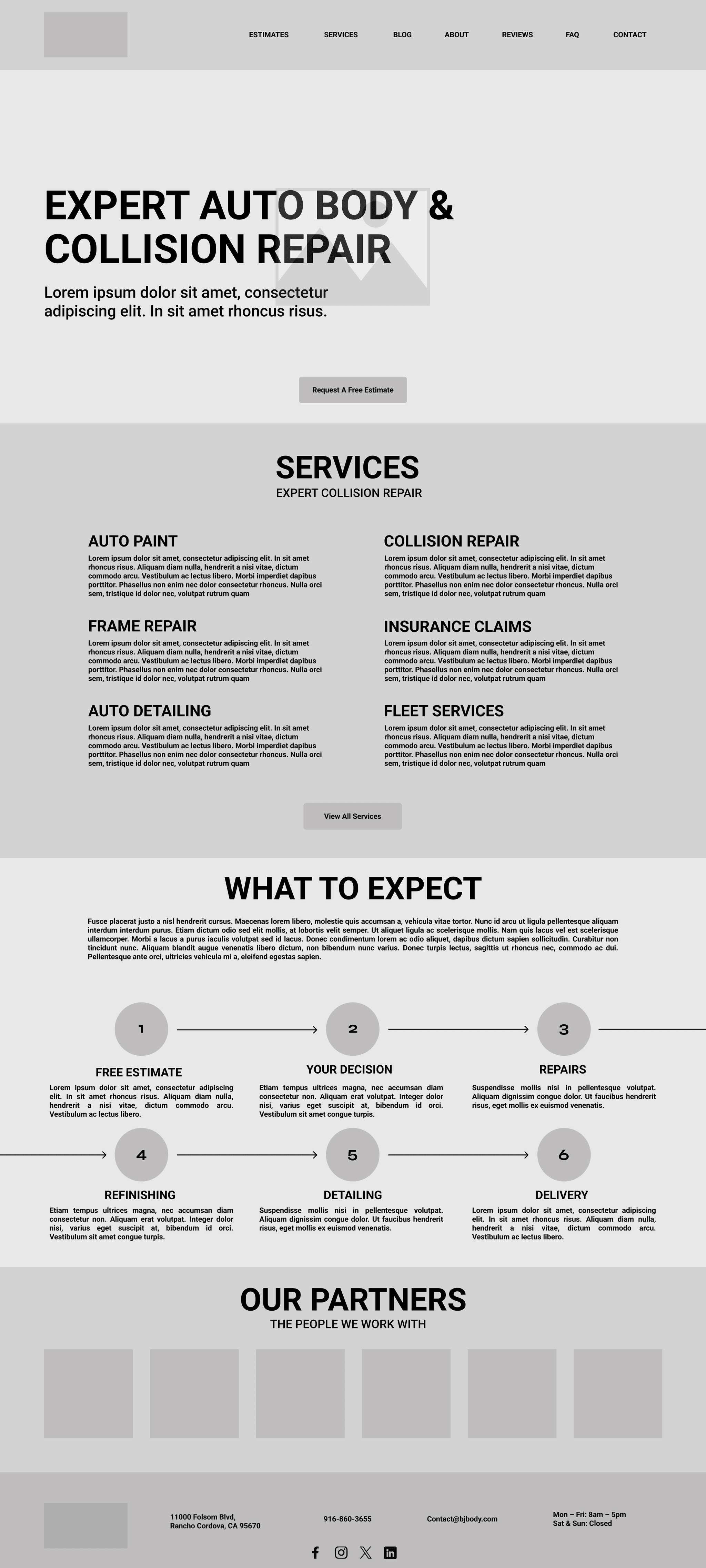
Home Page wireframe
This home page wireframe was designed to make the company’s process feel approachable and transparent. The layout guides customers through each stage, ensuring they know exactly how the company supports them from start to finish.
High-fidelity designs
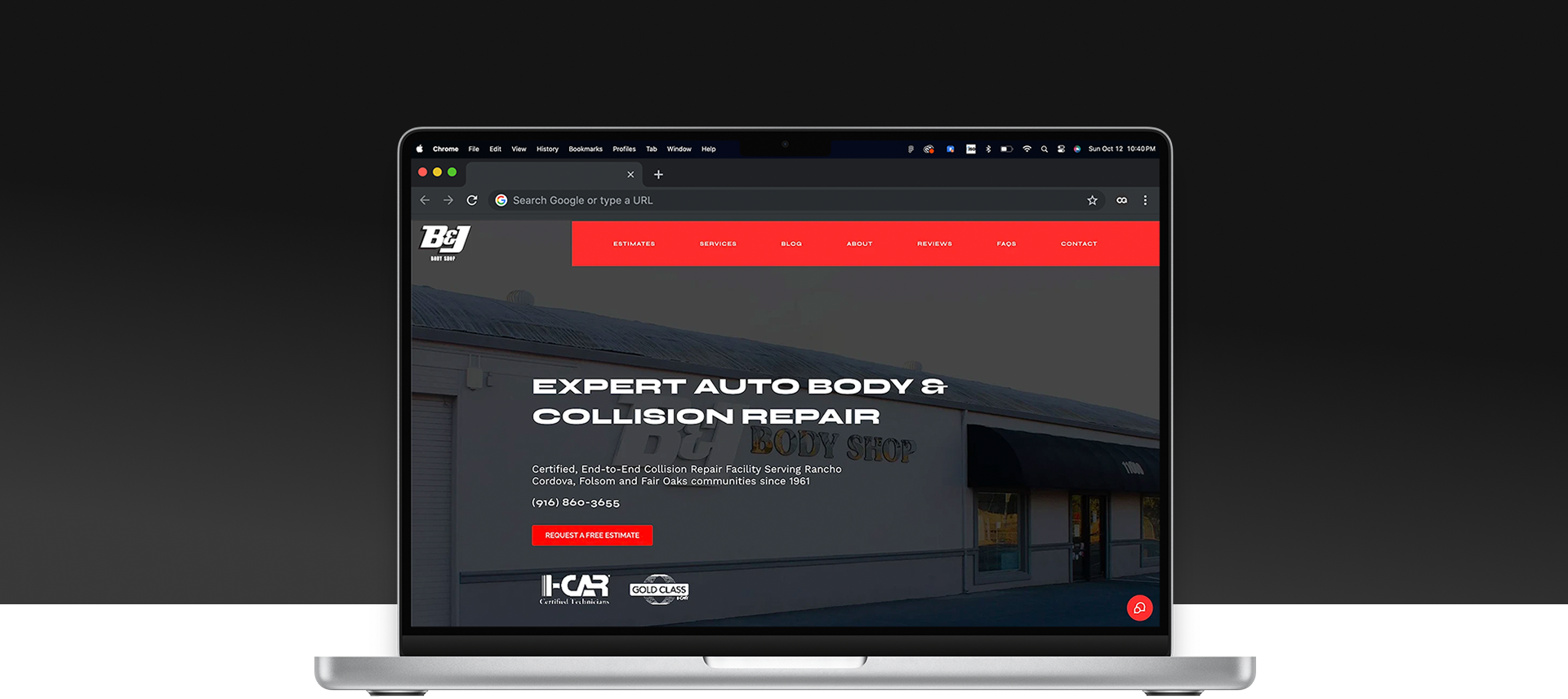
The Home, About, and Reviews pages were brought into high-fidelity to capture both function and feeling. The visual design focused on communicating B&J Body Shop’s professionalism and care through clean layouts, bold imagery, and clear messaging. The Home page highlights the repair process and key services, helping customers understand what to expect from start to finish. The About page reinforces trust by showcasing the shop’s experience and commitment to quality, while the Reviews page builds credibility through real customer stories. Across all pages, the design balances clarity and confidence—creating an experience that feels trustworthy, transparent, and easy to navigate.
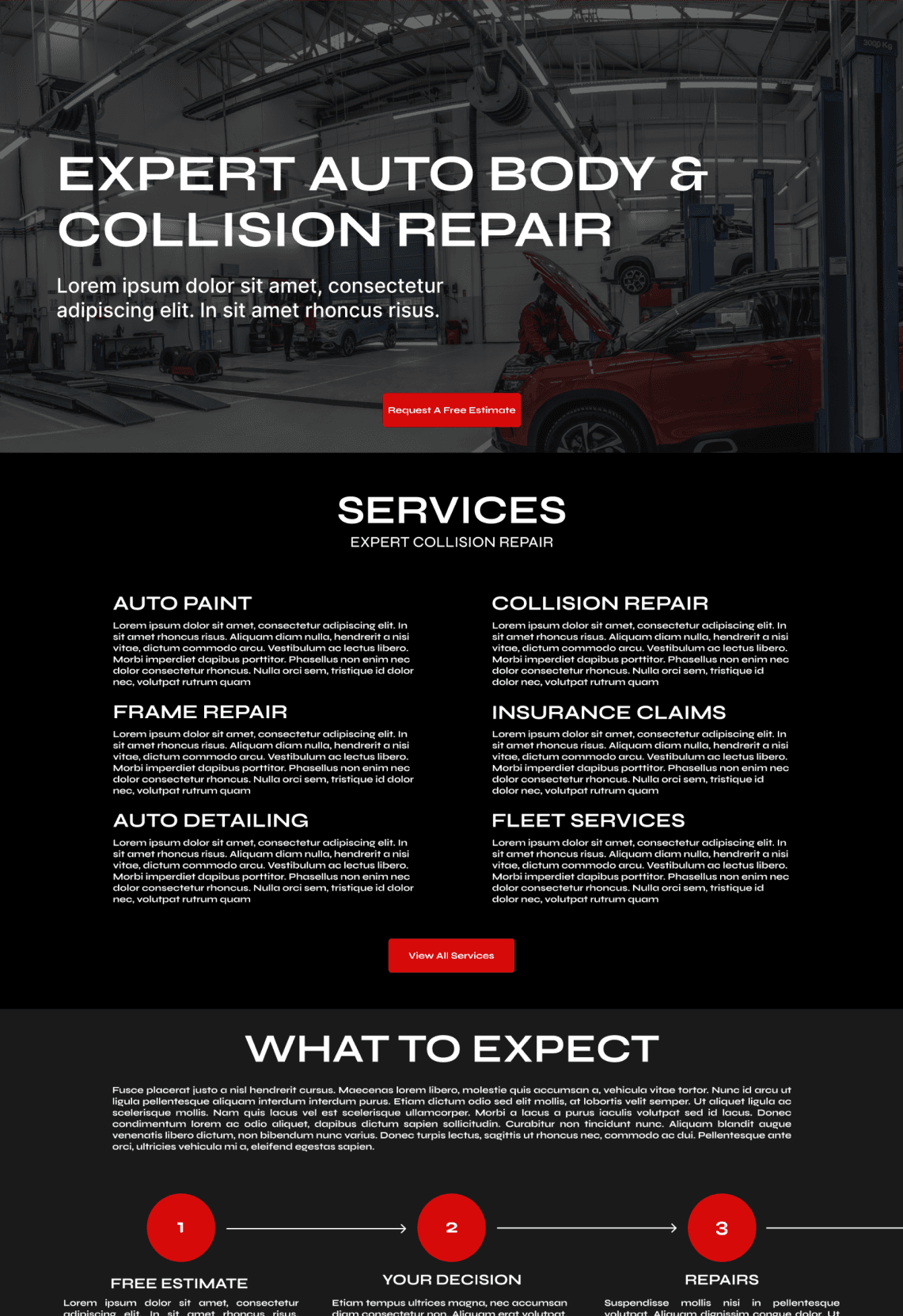
Home Page
About Page

Reviews Page
Project outcomes
The redesigned site was handed off in September 2021, laying the groundwork for a clearer and more trustworthy online experience. From the site map to the final wireframes, each decision focused on helping customers understand the repair process and easily take action—whether requesting an estimate, learning about services, or reading reviews. The highlights below showcase the key improvements that strengthened both usability and customer confidence.
Improved Process Clarity
Customers can now follow the repair process step by step, reducing confusion and building trust in the services offered.
Updated User Interface
The interface now feels lighter and more organized, making information easier to scan and understand at a glance.
Enhanced Credibility
Highlighting reviews and service details upfront reinforces confidence, helping visitors make informed decisions quickly.
Key takeaways
This project reinforced several strategic principles that guided design decisions and strengthened the overall user experience. The following points summarize the most important lessons and design priorities that emerged:
- Design for clarity and trust: Ensure the site communicates the repair process clearly, so both new and returning customers understand what to expect.
- Prioritize key actions: Make requests for estimates, scheduling, and service inquiries easy to find, reducing friction and improving conversion.
- Balance function and feeling: A visually clean, approachable interface communicates professionalism while keeping users engaged.
- Test early and iterate: Wireframes and prototypes revealed potential pain points early, saving time during high-fidelity design and development.